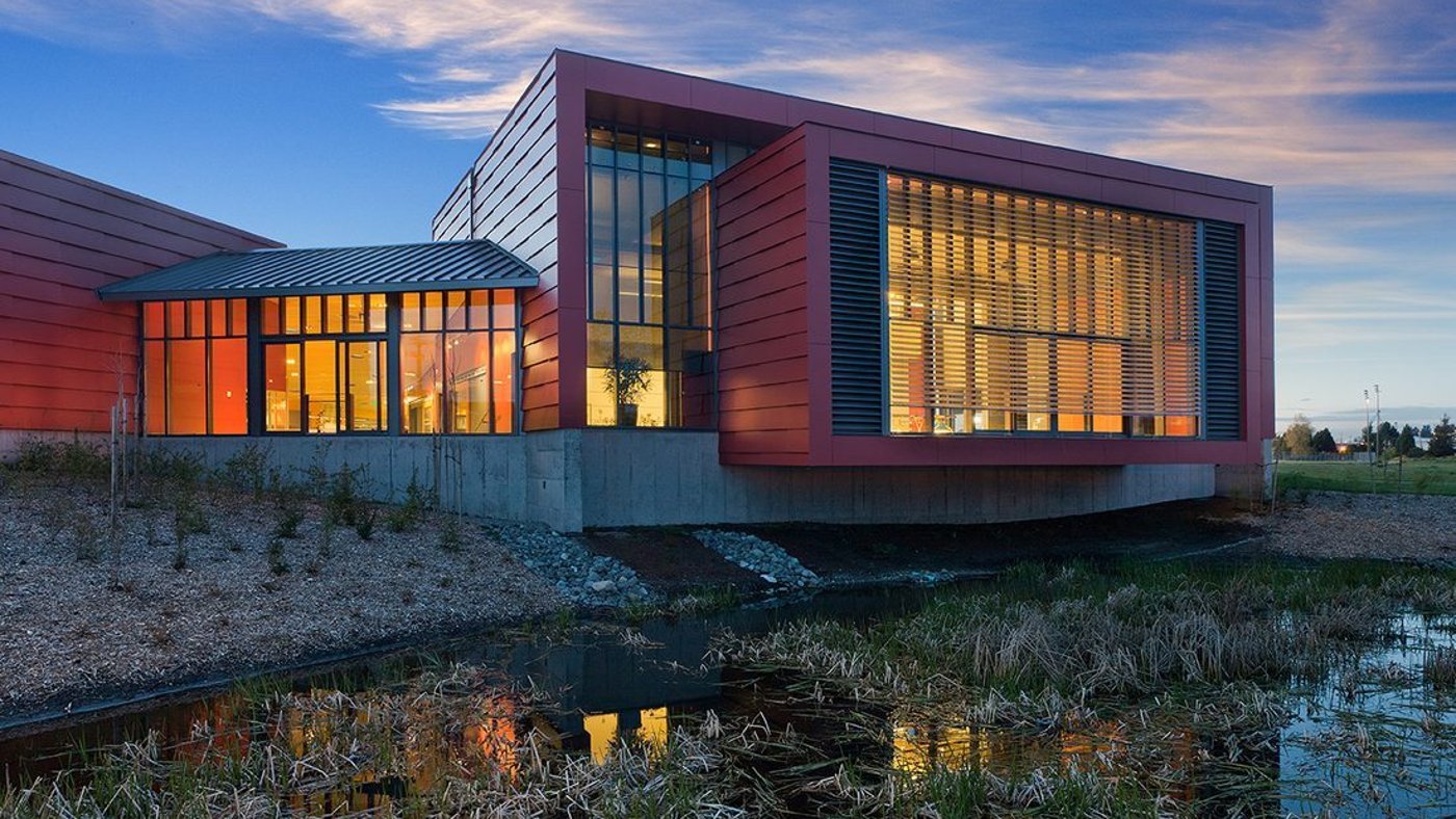
Benx's Ian Wilson made an unusual case, that before a façade insulates or resists fire, it does psychological work on everyone who passes it, and that colour, texture and form are the tools.
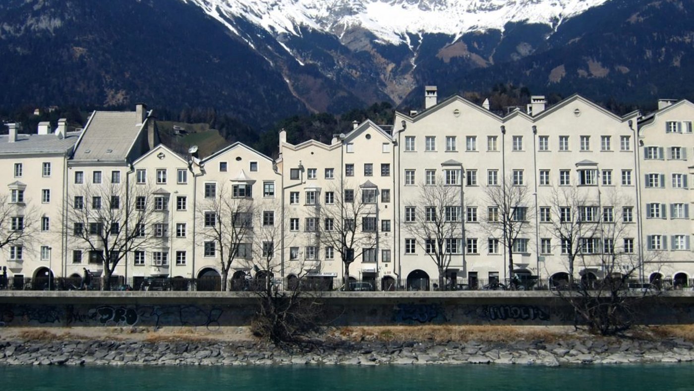
Façade engineering is mostly about performance, U-values, fire, air-tightness. Ian Wilson, chairman of Benx, started somewhere else: with the reminder that a building's exterior is the part almost everyone experiences and almost no one enters, and that it starts working on us before we are even conscious of it.
Why façades matter
Wilson's framing rested on a handful of numbers. A façade lands a "pre-cognitive hit" in about fifty milliseconds, we respond emotionally before we have consciously registered the building. Something like 76% of people, he said, report a façade affecting their mood. There is a nought-to-three-metre "interaction zone" where materials and detail are read close-up, and an engagement ratio of more than 100:1 between how often a building is seen from outside and how often its interior is. If those numbers are right, he argued, the exterior is doing an enormous amount of quiet work, and it is worth designing deliberately.
Benx itself is a UK business founded in 1998, working in external wall insulation and rainscreen systems across new build, remediation and energy-efficiency projects, with what Wilson described as a strong emphasis on innovation, testing and certification. But the bulk of it was a framework, not a pitch.

Three axes: colour, texture, form
Every façade decision, Wilson suggested, locates a building within a design space defined by three axes. The first is colour, hue, saturation and value, which he treated as a control on arousal: warm hues activate, cool hues restore, and saturation scales the emotional intensity. He walked a "colour response spectrum" from urgency and energy at the warm end to restoration and calm at the cool.
The effects he attached to each were specific. Warm colours, reds, oranges, terracottas, raise heart rate and cortisol within seconds, push perceived temperature up by two to four degrees, increase perceived depth through chromostereopsis and lengthen social dwell time outdoors, but risk fatigue at high saturation or scale. Cool and neutral tones, blues, greys, whites, lower blood pressure and perceived stress, sharpen focus, read as competent and authoritative and aid attention restoration (a nod to Kaplan's 1995 work), but risk coldness if unrelieved by texture. Natural colours, earth tones and greens, lower cortisol, build a sense of balance and belonging and read as stable, at the risk of drabness on a grey day; his suggested home for them was healthcare, education and residential.
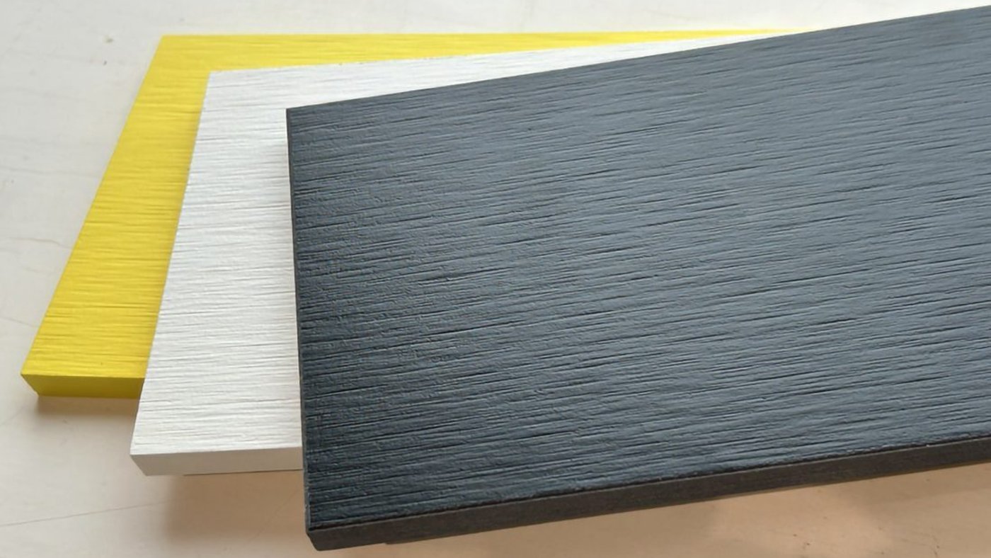
Texture was the second axis: textured-but-regular surfaces read as warm, permanent and human-scaled, their craft legible up close, while smooth and planar surfaces read as precise, authoritative and modern but risk alienation without warmth. Form was the third, illustrated with buildings like Antwerp's Port House and Baku's Heydar Aliyev Centre.
The sweet spot
Tying the axes together, Wilson landed on a "sweet spot" between two failures: too simple is boring and forgettable; too complex is overwhelming and cognitively taxing. Maximum human engagement, he argued, sits where complexity and order are balanced, engaging but still understandable. He reached for Cézanne, "colour is the place where our brain and the universe meet", and closed on Heatherwick's line about making buildings "radically more human… that people love and adapt, not hate and demolish."
The system underneath
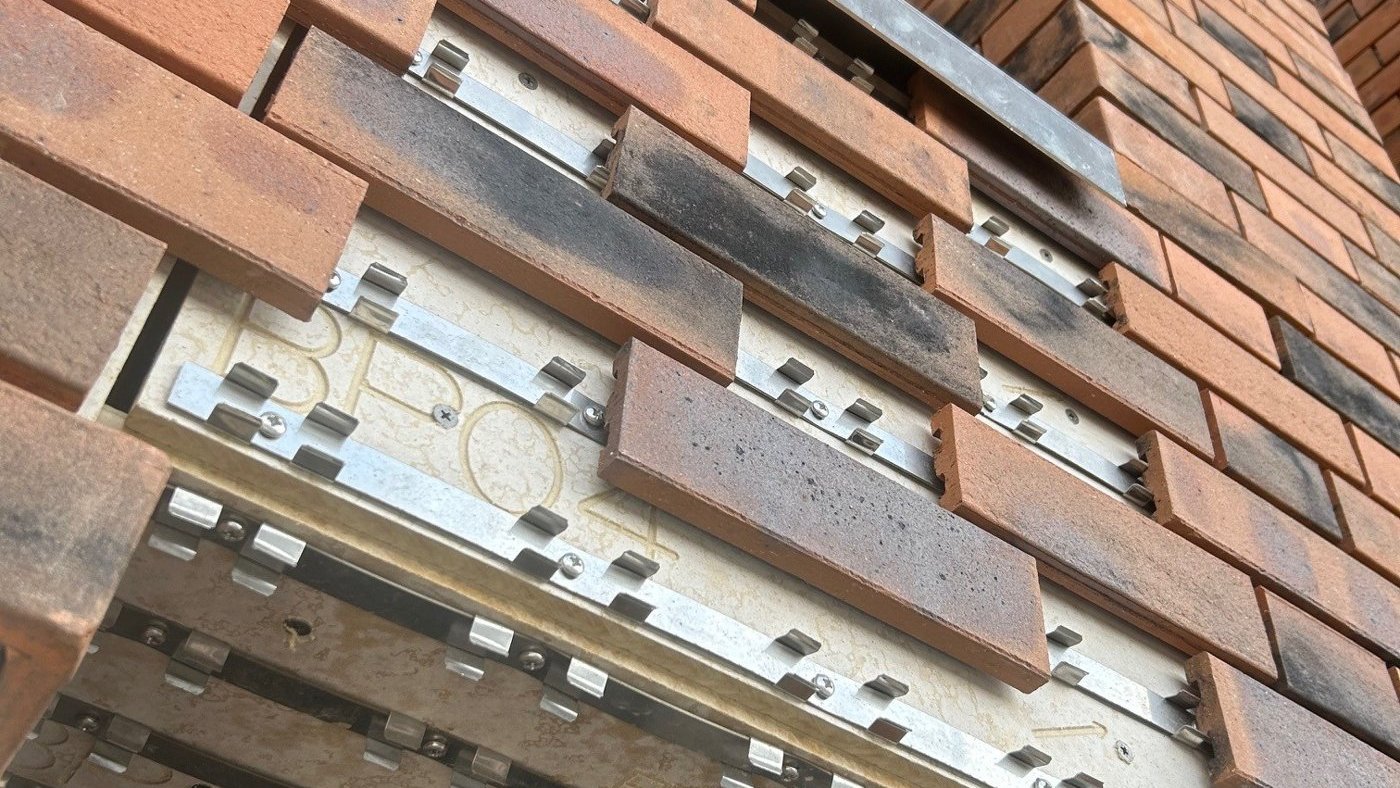
The engineering payoff was Benx's Safewall, a KIWA-certified rainscreen system, A1/A2 fire-rated to EN 13501-1, offered as a single supplier and single source of technical support with installer training and a system guarantee covering all components, delivering a seamless rendered or brick-slip rainscreen over light-steel or timber frame. The argument, in the end, was that the expressive choices and the certified system are not separate conversations: colour, texture and form are what people feel, and a tested, guaranteed build-up is what lets you deliver them safely.