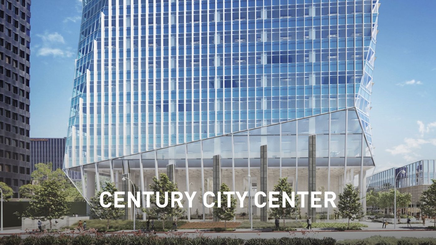
John Gralewski and Todd Thongeiam show how Century City Center turns a constrained Los Angeles site into a highly glazed workplace whose façade responds differently to each orientation, while transit access, a public park and flexible planning reinforce the environmental strategy.
Site and views shape form
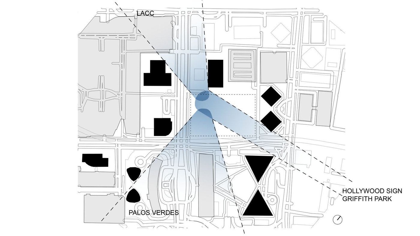
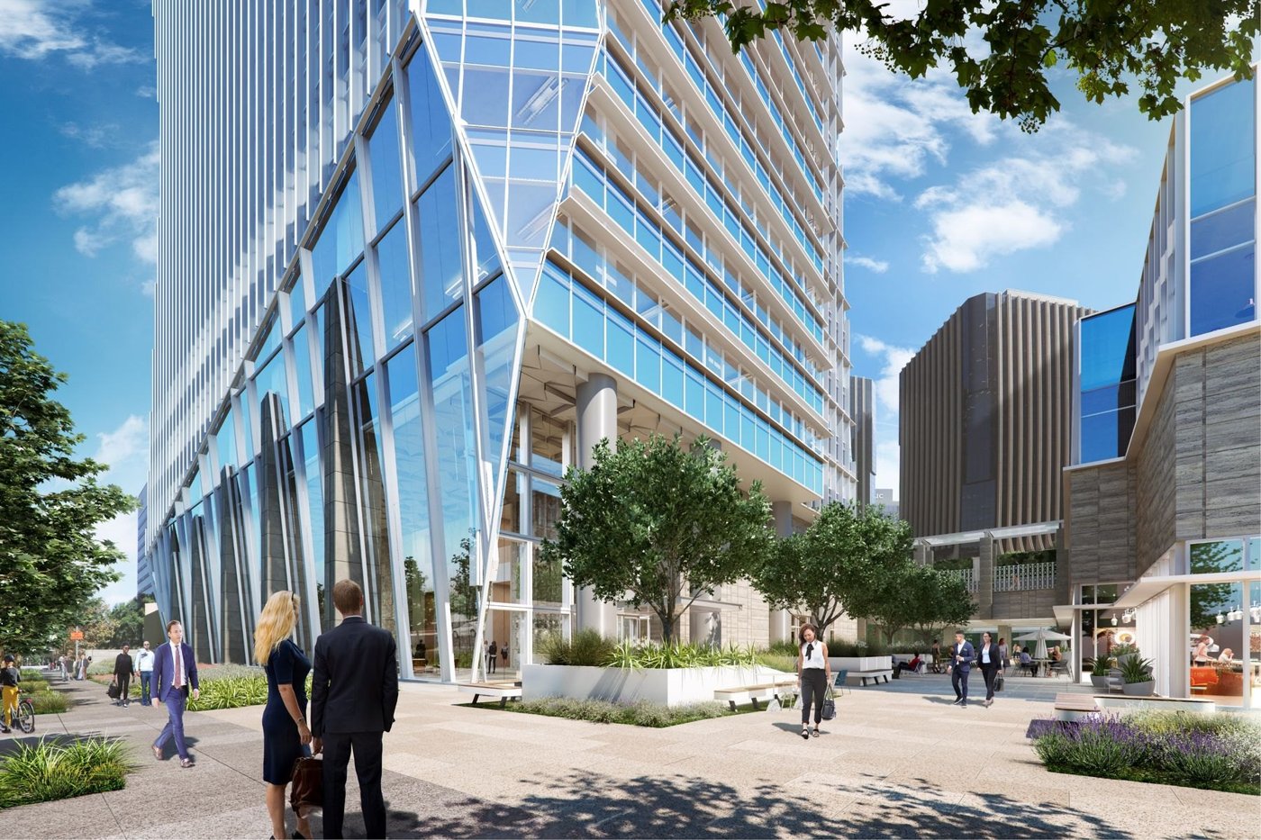
Century City Center occupies the last major developable parcel in Century City, a location already framed by towers, major roads and long-distance views. The design places the office tower towards the north-west of the site and gives much of the remaining ground to an elevated landscaped park. That move is more than an amenity gesture: it separates the tower from neighbouring development, opens outlooks towards the city and coast, and creates a public-facing landscape beside a new Metro connection. Inside the tower, a five-foot planning grid supports the flexibility expected of professional office space.
Shading follows orientation
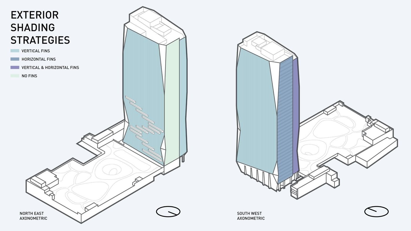
Solar control is allocated by exposure. Horizontal fins are concentrated on the south elevation, where high-angle sun can be intercepted by projections that also work as light shelves. East and west elevations use vertical elements to address lower-angle morning and afternoon sun, while the north side remains comparatively open. The south-facing horizontal projection reaches about 18 inches, with a gap to the glass that allows drainage and limits unnecessary weight. On selected areas, vertical and horizontal devices are combined to add depth while improving solar performance.
Mock-ups test construction
The most revealing part of the process is the performance mock-up, which was also used as an aesthetic test. The team selected a complex south-west corner where sloping geometry, shading elements and different glazing conditions meet, forcing the mock-up to test the difficult interfaces rather than only a typical bay. Construction then had to reconcile unitised curtain wall above with window-wall conditions below and accommodate changes in load path, geometry and sequencing.
Grid controls façade rhythm
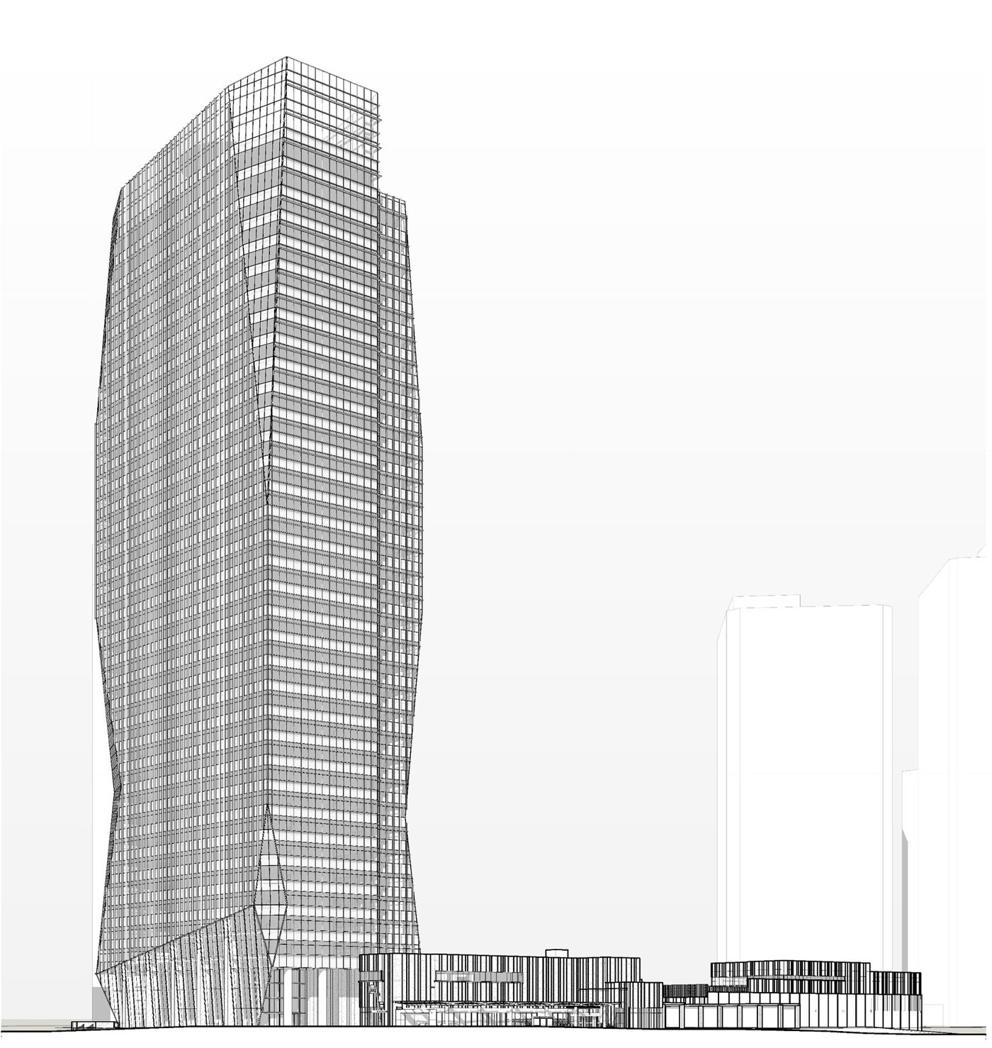
The tower's five-foot planning grid is important because the enclosure is not being asked to solve an arbitrary sculptural perimeter. It establishes a repeatable office module from which the faceted corners, shaded bays and special lobby conditions can depart. That discipline lets the façade retain the flexibility demanded by professional tenants while still responding to orientation. Against the 18 inches of the deepest south-facing shade, a selected vertical condition projects about 12 inches. Those dimensions are not simply compositional: they were studied against solar performance and interior view quality.
The location of the horizontal element also matters to the occupied room. Positioned near the upper part of the vision zone, it can act as a light shelf rather than a blind obstruction, admitting daylight above while shading the glass below. A small gap between fin and glazing provides a route for water and avoids unnecessary mass at the edge. In this way, the façade section is doing several jobs at once: moderating heat, preserving outward view, supporting daylight and giving the tower a legible horizontal datum. The architectural expression follows the environmental logic instead of disguising it.
Transit supports transparency
The enclosure strategy sits within that broader site plan. Giving a substantial part of the parcel to landscape and public movement affects façade performance indirectly: generous outlooks can be concentrated where they have real value, while the park and shaded circulation create a more temperate approach to a building that would otherwise meet the city as a highly glazed object. The sustainability argument is therefore larger than glass specification alone.
The performance mock-up is where those ambitions were tested against construction. The project illustrates a useful principle for high-rise offices: transparency is most credible when the planning grid, solar response, public realm and fabrication method are aligned. A façade cannot compensate for a poorly organised building, but it can make a well-organised one substantially more comfortable and durable.