


Bryce Given of Vitro made the case for tinted glass in a market fixated on clear, showing how colour, from the green of a forest to a deep bronze, changes what a façade says, how much you can see through it, and how a building connects to the life outside.
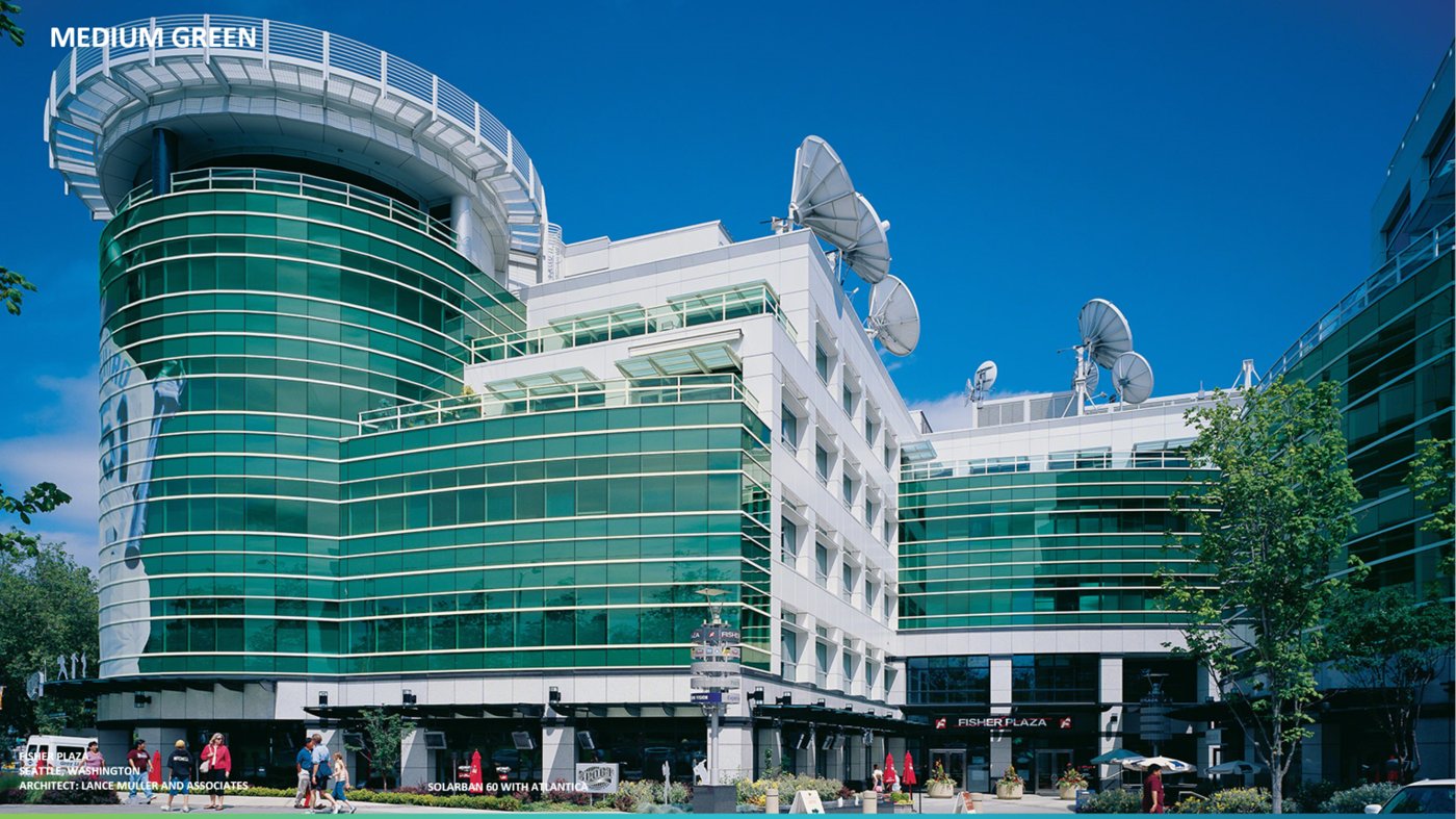
Given with Vitro out of Seattle, opened with a local observation: in British Columbia almost every project defaults to clear glass, architects and developers ask for the most clear glass possible. His pitch was for the opposite. Setting aside his usual numbers-heavy approach, and aptly for a talk on biophilic design, he chose to argue almost entirely through pictures: tinted, coloured glass, and what it does for a façade.
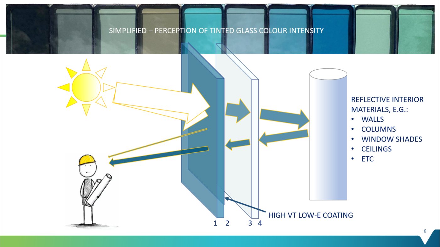
He started with visual connectivity, how well you can actually see in and out. For a retail storefront at 70% visible light transmittance, daylight has to pass through that 70%, reflect off the interior and come back out, so 70% multiplied by itself is a 49% effective transmittance; and with real garments rather than a perfect mirror behind the glass, the figure is closer to 30%. It is a simple multiplication, but it governs how connected inside and outside really feel.
Colour changes the physics of reflection. Tinted glass reflects only about 6–9% of light, against 11–13% for a standard clear high-VLT low-e and 19–40% for reflective glass. With tinted glass the daylight passes through, reflects off the interior material and returns, so the colour you see depends on what sits behind it: bright window shades read as vibrant colour, darker interiors as something more muted.
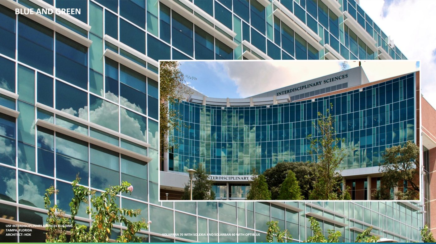
Then the colours themselves. Given began with green, his favourite and the most biophilic of them. “Green is the colour of life, of photosynthesis, of renewal,” he said, pointing to the forests around Vancouver; done richly, and especially when curved, a green façade has a timeless quality. Vitro makes ten tints, many of them non-proprietary, and there is a growing trend of combining them, greens with blues, which also lends privacy and hides the fact that several tenants can sit behind a single skin. As he put it, the glass is the personality of the façade.
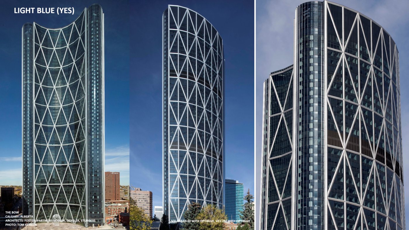
Blues are the trickiest to handle: a light blue can read dark and a dark blue can read light, depending entirely on the interior massing, the colour of the window shades and the depth of space behind the glass. He walked through examples across Boise and Calgary, including The Bow, where two different fabricators glazed a double-silver low-e that shifts with the interior and the sky. Bronze remains popular where the sun shines most of the year; grey can carry a hint of blue; black glass still exists for a very dark, private aesthetic; and newer reflective options, neutral blue, neutral silver and, this year, a warm champagne on clear, keep the clear-glass look while adding a tint of character.
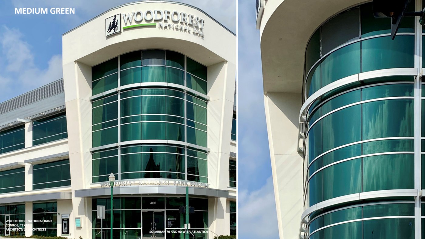
The throughline, true to the brief of going beyond transparency, was that clear glass is a default rather than a requirement, and that colour is a design tool. Chosen well, and read against whatever sits behind it, a tinted skin can give a building privacy, coherence and, above all, a living connection to the colour of the world outside.