


Prashanth Kharche of Kharche & Associates argued that the façade is the face of a building, never wrapping paper, and that its hardest test in India is surviving the value engineering that always arrives halfway through a project to cut its corners. His answer is to design the façade from day one for posterity, with ‘zero architectural botox,’ and to deliver the visual exactly as promised. He showed it through three projects: a Balinese-style seaside holiday home, a windowless jewellery showroom, and an office that became a food-and-beverage building, each finding character within a real budget.
If the floor plan is the brain of a building, the façade is its personality, the building’s first handshake with the street, its environmental filter and its primary defence, often all three at once. It must be designed for posterity, with what he called ‘zero architectural botox’: too many façade materials look good at a launch but do not age or maintain as promised, a real problem in India’s harsh maintenance reality. Gravity, pollution, rain and flooding all shape how a façade weathers, and all of it belongs in the thinking before a line is drawn.
His sharpest observation was about money. Somewhere around the halfway mark, he said, the client almost always calls for value engineering, and the corners that get cut are, more often than not, in the façade. The lesson is to understand that from day one and design the façade so that it accentuates the parts meant to carry its character, without leaning on materials that will quietly be dropped, leaving a last-minute ‘kit’ of a building. To make the point concrete he set aside his larger projects and took three smaller ones.
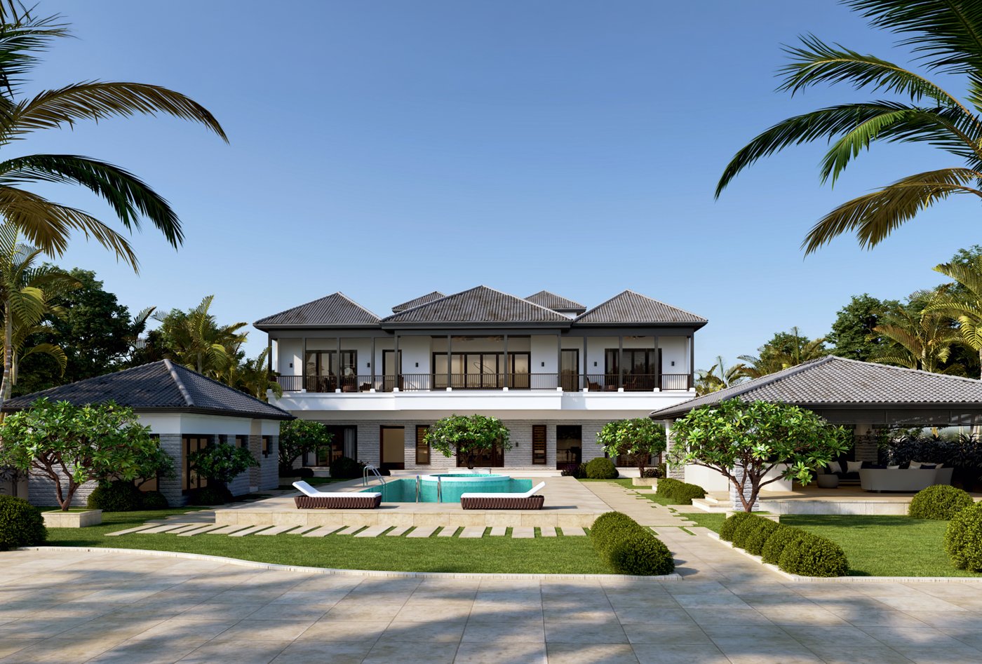
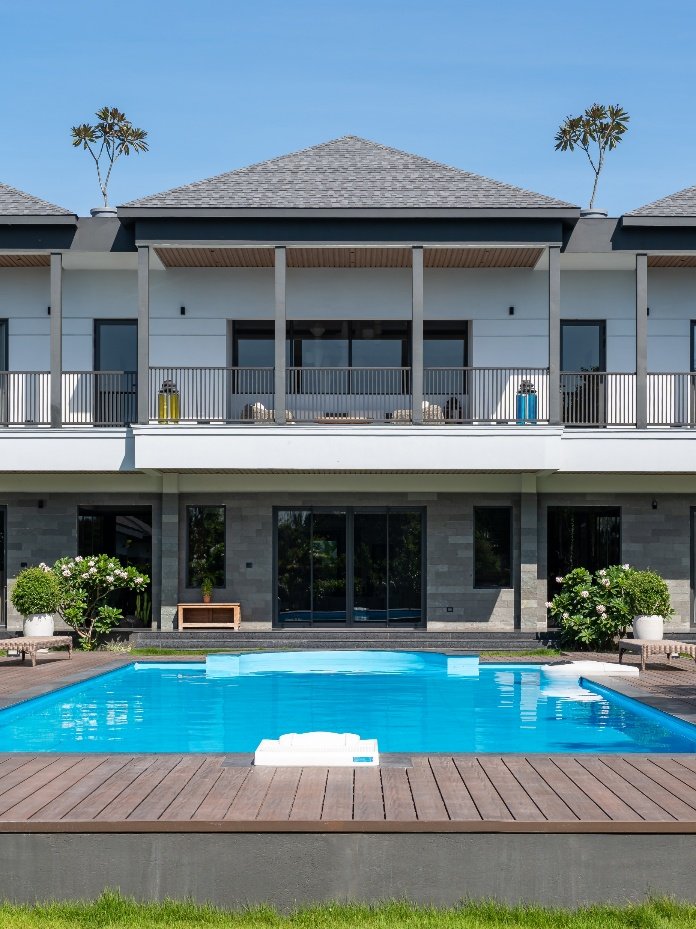
The first was Ananda, a seaside holiday home for a close friend, briefed, memorably, in a two-in-the-morning phone call, as a Balinese-style house after the client’s family had fallen for a resort in Bali. The sea, an architect’s frequent enemy, forced the main house to be oriented to the southwest; and because sea views were blocked at ground level by buildings in front, the design turned inward, making a swimming pool the focal element that anyone in the living room or at the bar would look onto. The house divides into three segments, a double-height public centre, dining and kitchen to the east, bar and guest room to the west, bedrooms above, with eastern balconies that cut the harsh sun and read as a façade element, and an entrance sequence arranged so that a guest sees the whole façade at once on arrival.
Its materials were a lesson in value engineering done well. The client feared clay-tile leakage in Chennai’s heavy rain, so the roof kept its slopes but was built in RCC and finished with shingles to save cost. Aluminium joinery was unavoidable by the sea, so a light, wood-grained grey-textured aluminium profile was used where the façade needed to speak and plain grey elsewhere; slate clad the ground floor, where a much-used surface needed to be cleanable; aluminium handrails matched the balcony columns and window joinery; and in the lounge a GFRC column cladding, sculpted on site by an artist, stood in for slate. A time-lapse from the 3D visualisation to the finished house made his real point: clients do not want to hear about a designer’s technical troubles, they expect the visual delivered exactly, and here they got precisely what they had seen.
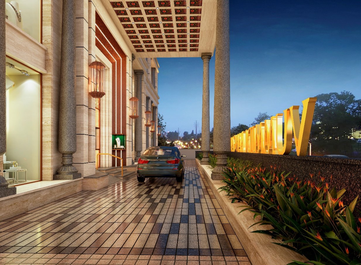
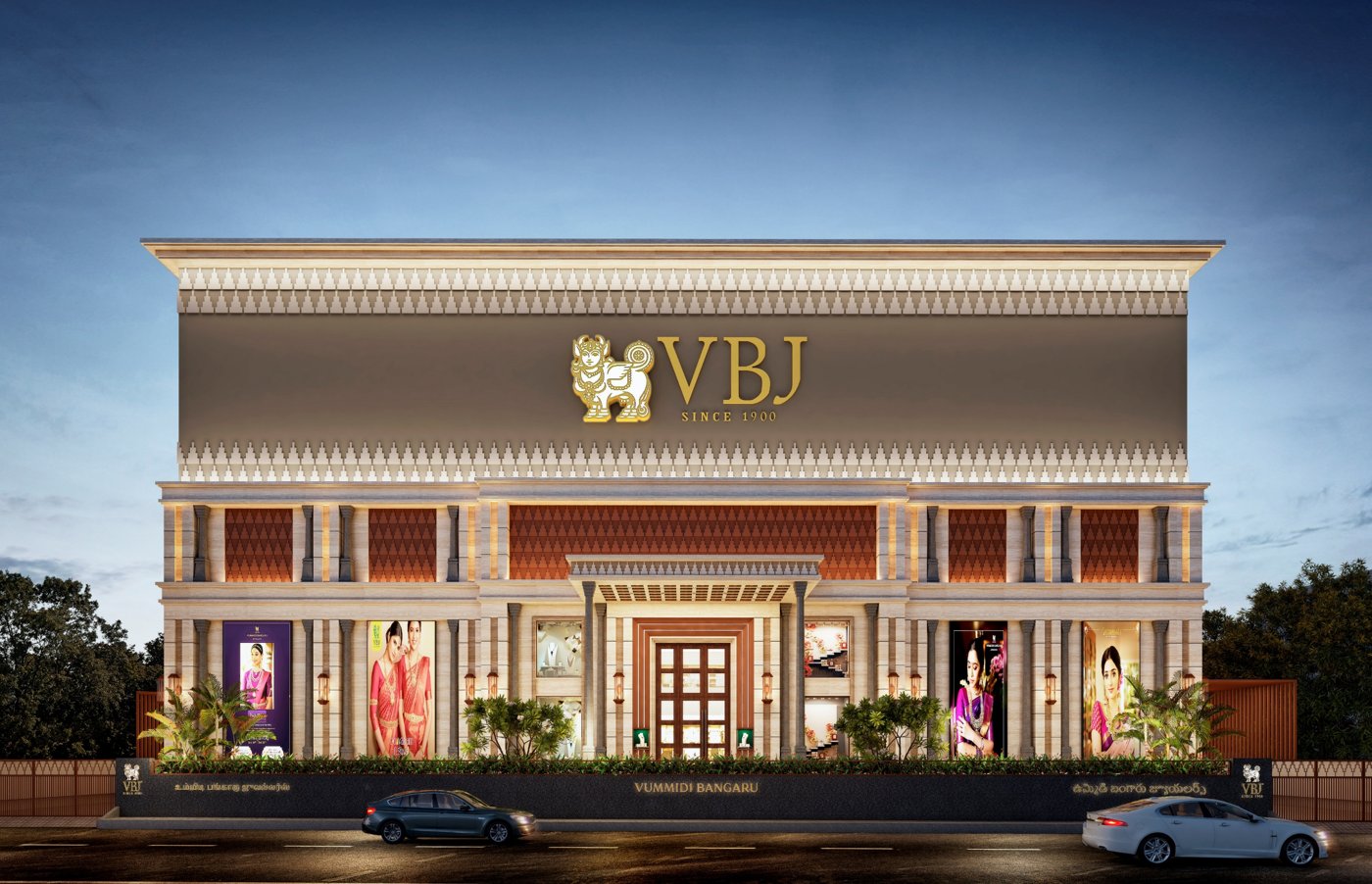
The second project inverted the problem. A corporate jewellery brand, its identity built on a temple motif, wanted something iconic on a plot it had waited more than two decades to acquire, but jewellery showrooms shun windows, for security and because artificial light flatters the pieces, so the challenge was a face with almost no cutouts. Rather than clad the whole thing top to bottom, the easy and uncreative route, Kharche built a double-height entrance and wrapped the street-facing floors in travertine, part of the brand’s language; treated an upper level specially, with insets and lighting, because it is seen clearly from the adjacent Gemini flyover; and added four hollow GFRC ‘Chettinad’ columns to carry the family’s regional character. The one deliberate opening is a sixteen-foot glazed portico, so a visitor enters with daylight behind them before turning into the display halls. The ornamental panels were made in GFRC and painted, chosen over marble, which is slow and unworkable, and even the logo was placed to face east, north and south, but pointedly not west.
The third showed a brief changing underneath the architect. A site he expected to become an office turned into a food-and-beverage building when office rentals proved weak and the returns came only from F&B, forcing a change of mindset mid-design. He kept the site’s existing trees as natural shading; wrestled with western sun striking the upper floors of a use that wants maximum vision glass, ‘a crime to put glass on the west, but you know how it is’, with a curved vision-panel base that plays off the road; and arranged the core and services so the large industrial kitchens sit at the rear, leaving clear, uninhibited frontage.
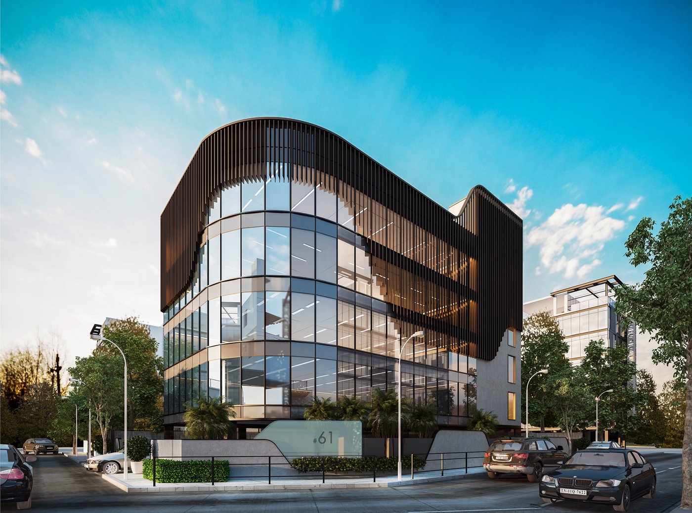
Across all three, the convictions held. The façade is the face and the defence of a building, designed for posterity rather than for its launch photograph; it is planned from day one to survive the value engineering rather than be sacrificed to it; and the visual is delivered as promised, in his words, very nearly what you see is what you get, because that is where a client’s trust is built. Visual impact and climate performance on a realistic budget, on his account, are not a compromise to be managed but the discipline itself.