


Nicholas Hofstede describes Ray Phoenix as an exercise in disciplined reduction. A rigorous grid, carefully rationed depth, alternatives to conventional balconies and a monolithic colour strategy turn a highly varied residential programme into a singular urban object.
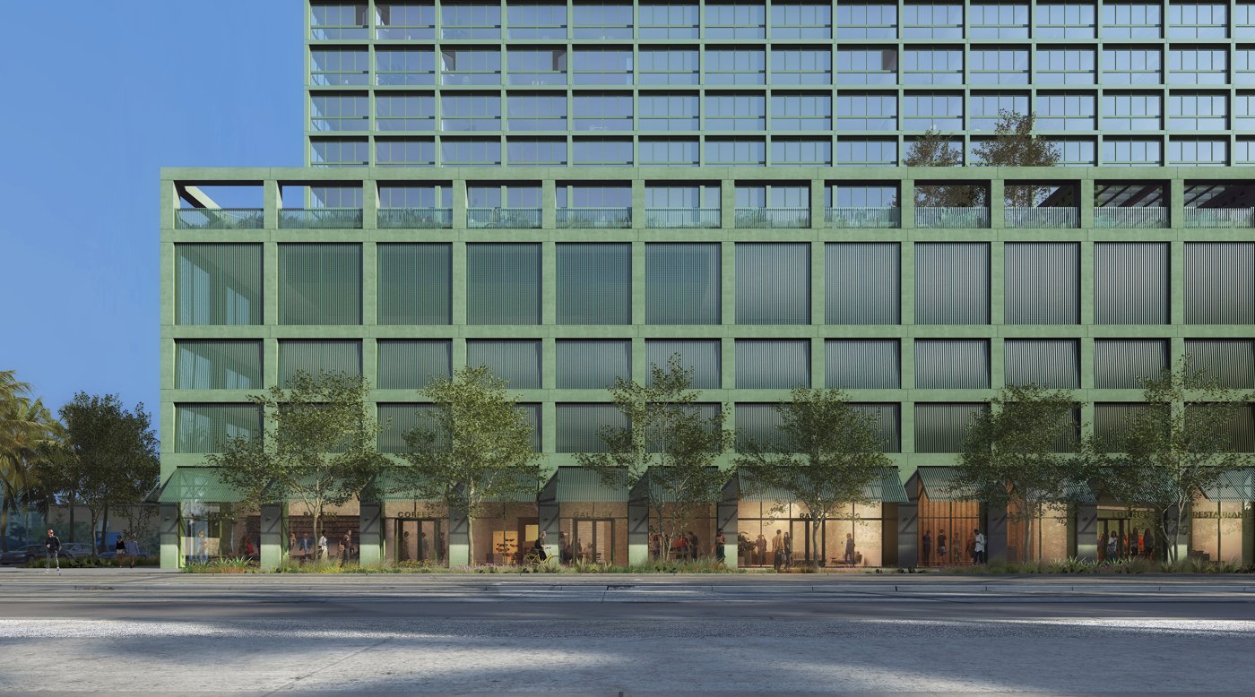
Ray Phoenix contains all the irregularities expected of a large mixed-use residential tower: retail, parking, amenity floors, studios, larger apartments, double-height spaces, a core and a mechanical top. Hofstede's design strategy is not to express every one of those differences. It is to absorb them into a stronger order. The 26-storey building, with a five-storey podium and a 21-storey tower above, is organised around a small set of façade principles that remain visible from the street to the upper floors. Grid, depth, balcony strategy and colour become tools for suppressing accidental complexity so the building can read with what Hofstede calls radical, or extreme, consistency.
The grid begins with the structure. A 14 ft module and roughly 9 ft floor-to-ceiling dimension provide a baseline that can continue even when the programme behind it changes. That is important because around 60 per cent of the approximately 400 homes are studios, while the mix extends to larger units and penthouses. Parking, amenity and mechanical requirements introduce completely different openings and service needs. Rather than allow those conditions to produce a patchwork elevation, Johnston Marklee used the grid to camouflage them inside a repeated framework. The façade becomes democratic in the sense that it does not advertise which unit is more valuable or which floor contains the most exceptional programme.
The grid absorbs programme
This restraint also responds to the building's urban position. Ray sits north of downtown in Roosevelt Row, where the surrounding plots are changing rapidly. Its broad east and west faces will acquire new neighbours over time, so Hofstede was interested in a building capable of acting as both foreground and background. A highly idiosyncratic silhouette might depend on today's open views; a consistent field can accept future urban density without losing its identity. The grid gives the tower enough neutrality to receive buildings around it, while its scale, depth and colour keep it from becoming anonymous.
Achieving that apparent simplicity required continual removal of exceptions. Early work reduced an already-entitled massing toward a basic podium-and-tower form, including a more deliberate termination at the mechanical parapet. Within the elevation, the same effort was applied to cores, amenity levels, openings and ventilation requirements. Hofstede compares the process to solving a Tetris puzzle: the visible grid should not have to bend every time the plan changes. What looks repetitive from a distance is therefore the result of detailed negotiation between structure, unit planning, services and cladding rather than a generic curtain wrapped around the building.
Eight inches can be enough depth
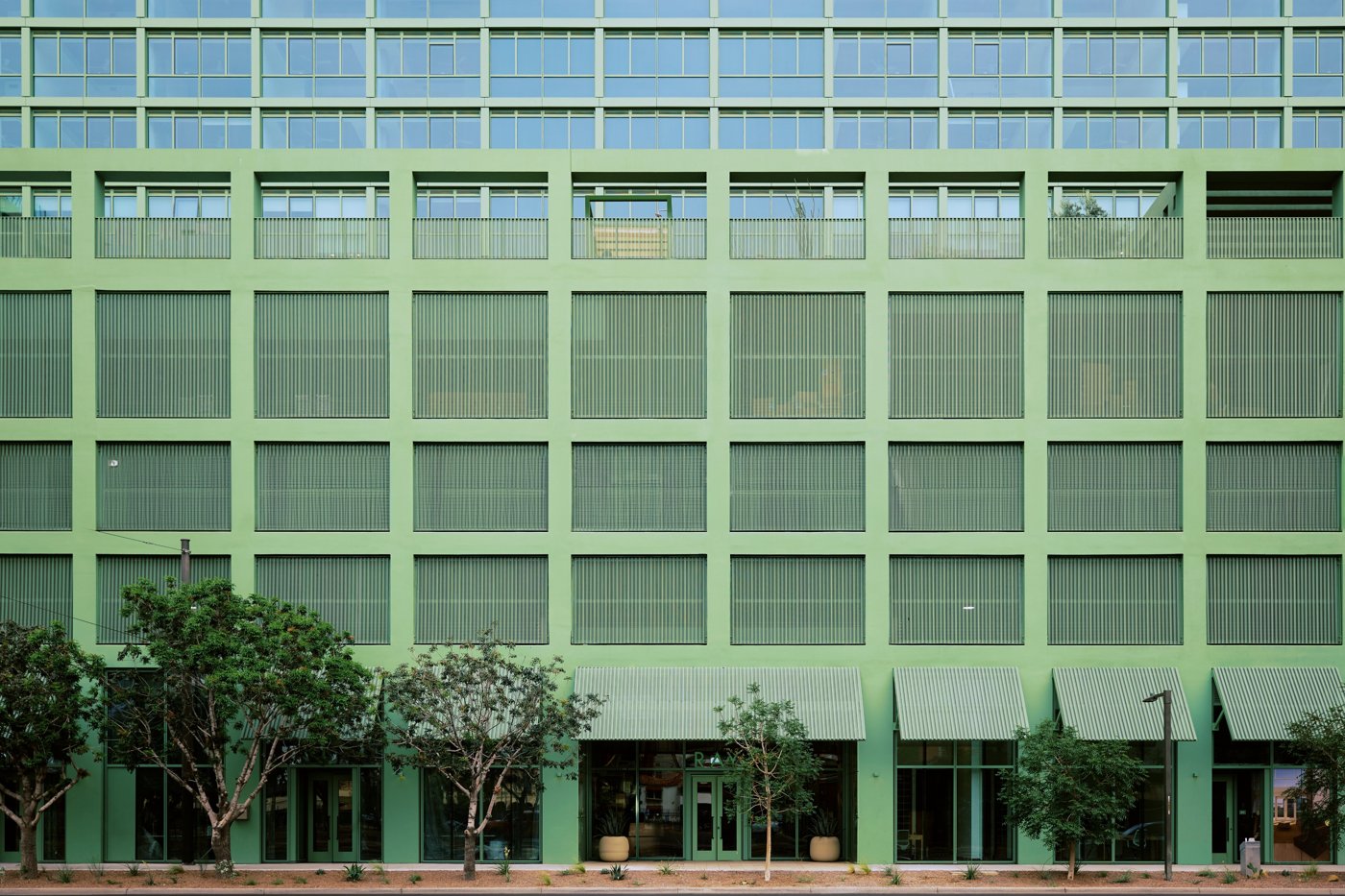
Once the grid was established, depth became the second lever. Hofstede is interested in getting the largest visual effect from a small physical move. On the tower, aluminium cladding elements are pushed forward by roughly 8 in where the economics allowed, enough to create a post-and-lintel reading and register strongly in raking desert light. The effect changes throughout the day: a façade that appears almost flat in frontal light gains strong bands of shade and shadow as the sun moves across it. Custom horizontal louvres are folded into that hierarchy to conceal exhaust openings without introducing a second unrelated language.
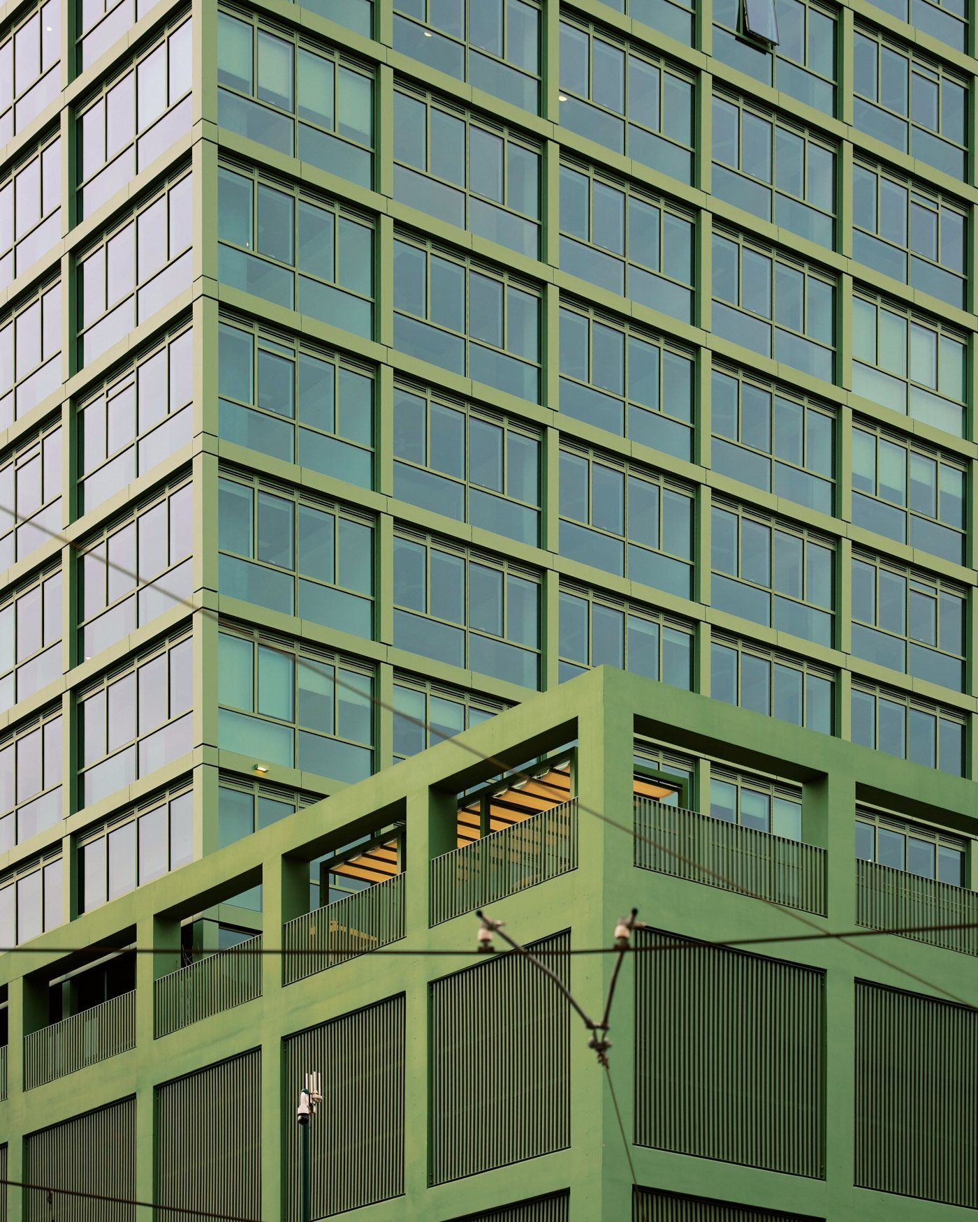
At the podium, the same idea becomes heavier and more public. Concrete gives the base greater mass, while an arcade and projecting frame produce shade and a clearer human scale at street level. The frame continues above the amenity deck so that the pool and shared outdoor spaces feel less like an exposed roof and more like a courtyard held within the building. That extension also frames longer views to the mountains. Hofstede's point is that depth is not simply formal relief. At different heights it can ground the building, shade circulation, create privacy and control the perception of scale without abandoning the governing grid.
The third principle is the conspicuous absence of conventional balconies. Hofstede acknowledges that balconies are a valued residential amenity, but they also interrupt a taut envelope and introduce economic, waterproofing and thermal-bridge consequences. The design therefore asks whether connection to the outdoors can be achieved without projecting platforms at every unit. Operable awning windows and a horizontal mullion arrangement create an interior edge that reads almost like a guardrail, while selected upper units use large bifold openings so a living room can become the outdoor room when conditions are favourable. The approach preserves the continuous façade while still giving residents agency over ventilation and exposure.
A monolithic colour makes irregularity tolerable
Colour is the final unifying device. Ray's saturated green draws from the desert landscape, from references including Taliesin West and from the colour identities of earlier Ray projects, but Hofstede also treats it as a practical architectural tool. When mullions, painted concrete, corrugated perforated aluminium and other visible components occupy the same colour family, inevitable construction hardware and small dimensional irregularities become less dominant. The eye reads the whole before it reads the exceptions. That supports the original ambition of a monolithic object without requiring every component to be made from the same material.
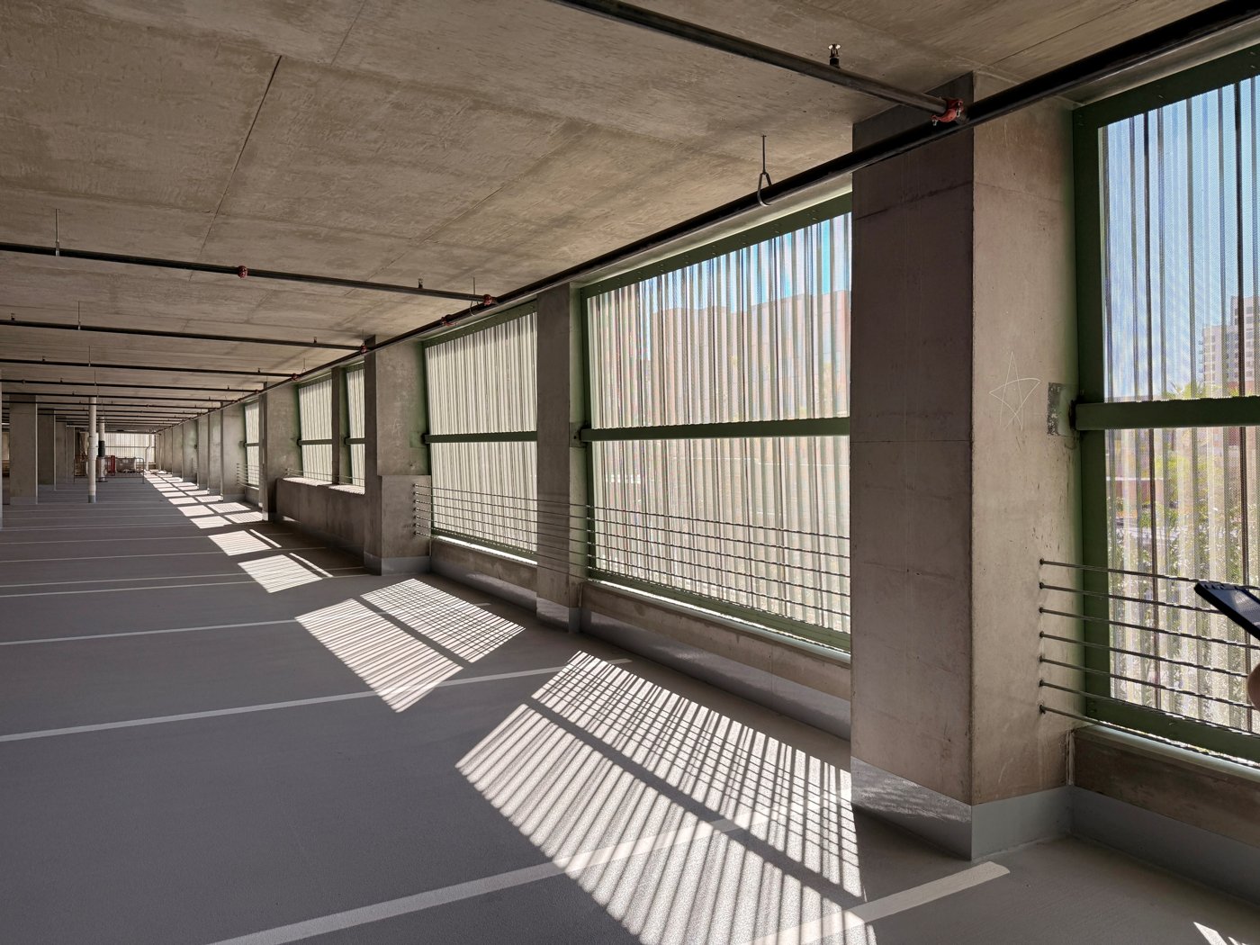
The perforated aluminium at the parking levels is especially important because it turns a utilitarian requirement into part of the architecture. Corrugation and perforation provide a veil that changes transparency with viewpoint and daylight. From the street it contributes to the singular green mass; from behind it, light and air can still move through the parking structure. The screen also adapts around pool and parking constraints without announcing every adjustment externally. It is another example of consistency being achieved through a flexible rule rather than by forcing identical construction everywhere.
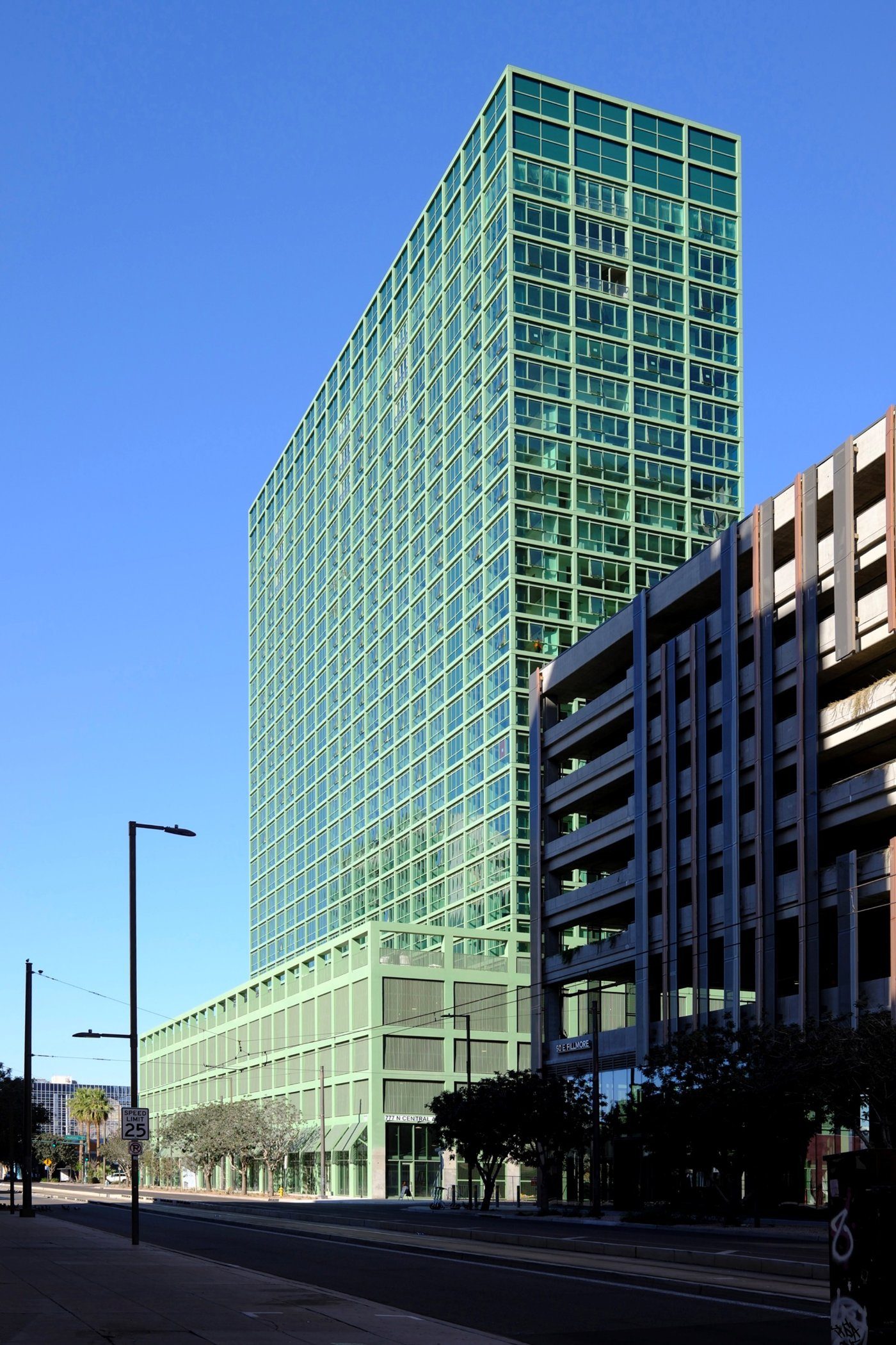
Inside, heavily tinted green glass supports thermal performance while feeling less coloured than the exterior suggests. That difference matters because the façade has to work simultaneously as city image and occupied boundary. The design's reductive appearance should not be mistaken for indifference to experience: operability, daylight, view, privacy and amenity are embedded in the same modules that create the abstract outer field. The goal is not visual purity for its own sake, but a framework strong enough to coordinate those requirements without letting each one become a separate architectural gesture.
Ray Phoenix therefore makes a useful case for discipline as a façade strategy. A grid can carry programme instead of simply decorating it. Eight inches of depth can produce shade, hierarchy and changing shadow. The absence of balconies can prompt alternative ways of connecting a room to the exterior. A single colour can reconcile several materials and absorb the small eccentricities of construction. None of those moves is individually spectacular. Their power comes from being repeated, coordinated and protected from exceptions until the building reads as one idea from many distances. Extreme consistency, in Hofstede's account, is not simplicity at the start; it is complexity that has been edited into a coherent system.