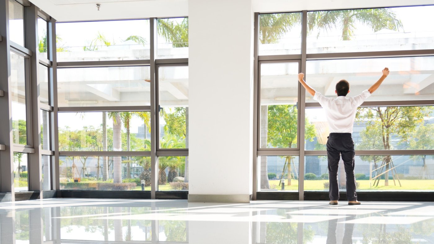
Matias Reyes set out biophilic design as a health argument rather than an aesthetic one, and ended on the specification that follows from it, a fourth number most projects never review.
Matias Reyes put biophilic design forward as a health argument rather than an aesthetic one, which changes what a façade is being asked to do. Daylight, greenery and organic shape are not, on this account, ways of making a space pleasant; they reduce anxiety and stress and support productivity, and their absence has a cost. The biophilia hypothesis holds that people carry an innate tendency to seek connection with nature and other forms of life, and the work since has found that being cut off from it damages physical and psychological well-being. The instinct is familiar enough – under strain people go outside and take a breath – and the design question is what the envelope can do about it.
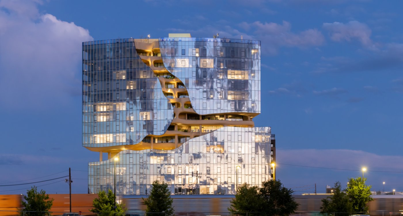
One River North in Denver is the case he used to show it working at building scale. The architects took Colorado's mountains and canyons and turned what would otherwise have been conventional outdoor space into a vertical landscape cut through the building. Softly curved balconies, earthy tones and warm light blur where the interior stops, and the curved glass in the façade accentuates that fluidity rather than fighting it. The glass is carrying the argument rather than decorating it.
Where the claim has been tested
Healthcare is where it has been pressed hardest, and where the findings are specific: patients with a strong connection to the outdoors heal faster and experience fewer complications, and Reyes said they require less pain medication. That puts daylight, views and planting in a hospital on a different footing from amenity. The threshold is lower than it sounds, too – ten minutes of immersion in nature is enough to reduce stress, sharpen cognitive function and lift mood.
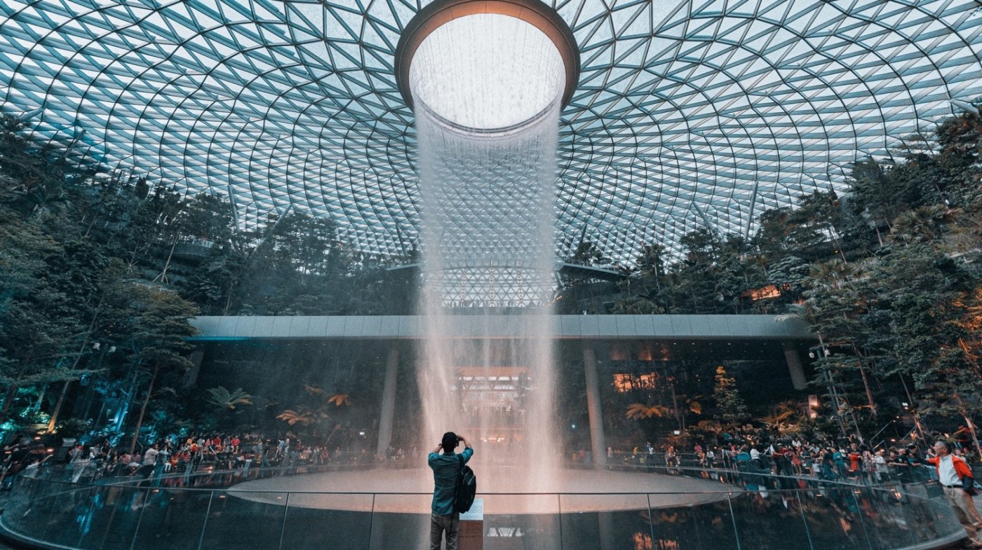
Two of his examples are places people pass through rather than live in. An airport terminal is usually endless corridors, escalators and a luggage carousel; the Jewel at Changi puts a waterfall at the centre of a light-filled dome and turns the same functional journey into something restorative. Amazon's Seattle offices go further into the idea: three conjoining glass domes with no desks, no cubicles and no walls, a geometry that deliberately resists straight lines and right angles, and more than 40,000 plants living in it.
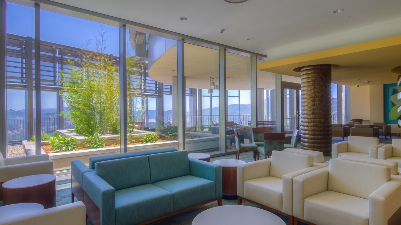
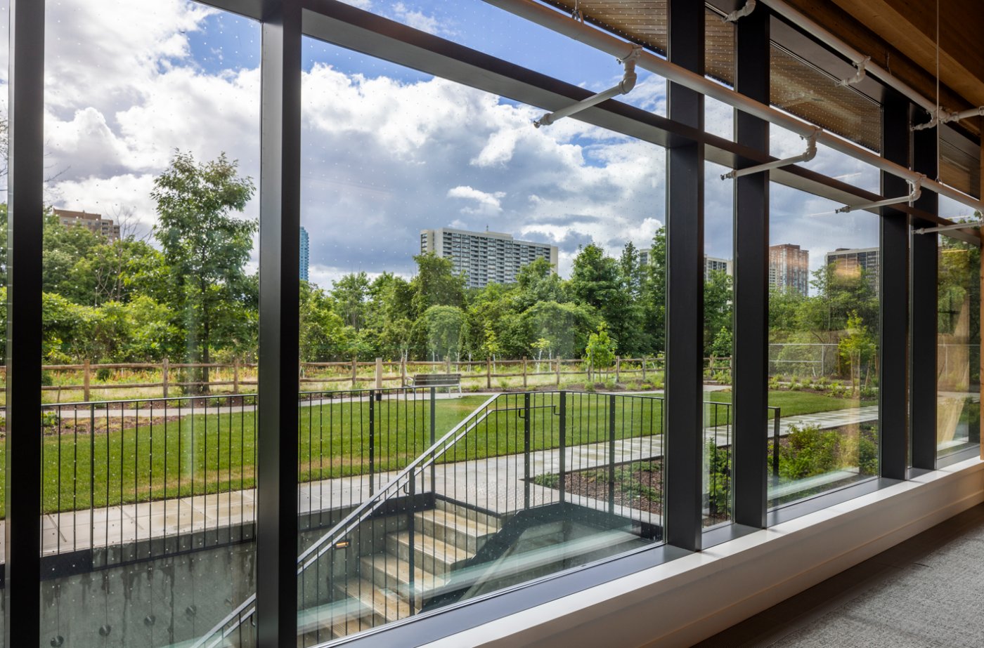
Closer to Toronto, Moriyama Teshima's building for the Ontario Secondary School Teachers' Federation sits above the Don Valley ravine. The mass timber structure supplies warmth and a tactile connection through exposed wood, and the expansive glazing brings the ravine inward rather than framing it as a picture. It is the same argument at a smaller scale and without the spectacle.
What it asks of the specification
Two consequences follow for anyone writing a glass spec. The first is that bird-friendly mandates now require material choices that protect avian life, and acid-etched treatments can meet the Toronto Green Standard while still passing a significant amount of light. The second is a number most projects never look at. Glass is normally reviewed on visible light transmittance, solar heat gain coefficient and U-value; on a project specifying ultra-clear or very neutral glass, Reyes argued that colour rendering index belongs beside them. In interiors CRI describes how artificial light alters the colour of objects. In architectural glass it describes how the objects behind the glass change – which, on a building whose whole case rests on the view out, is not a secondary property. It runs from 0 to 100, with ultra-clear at the top, and the usual route to a neutral result is low-iron glass.